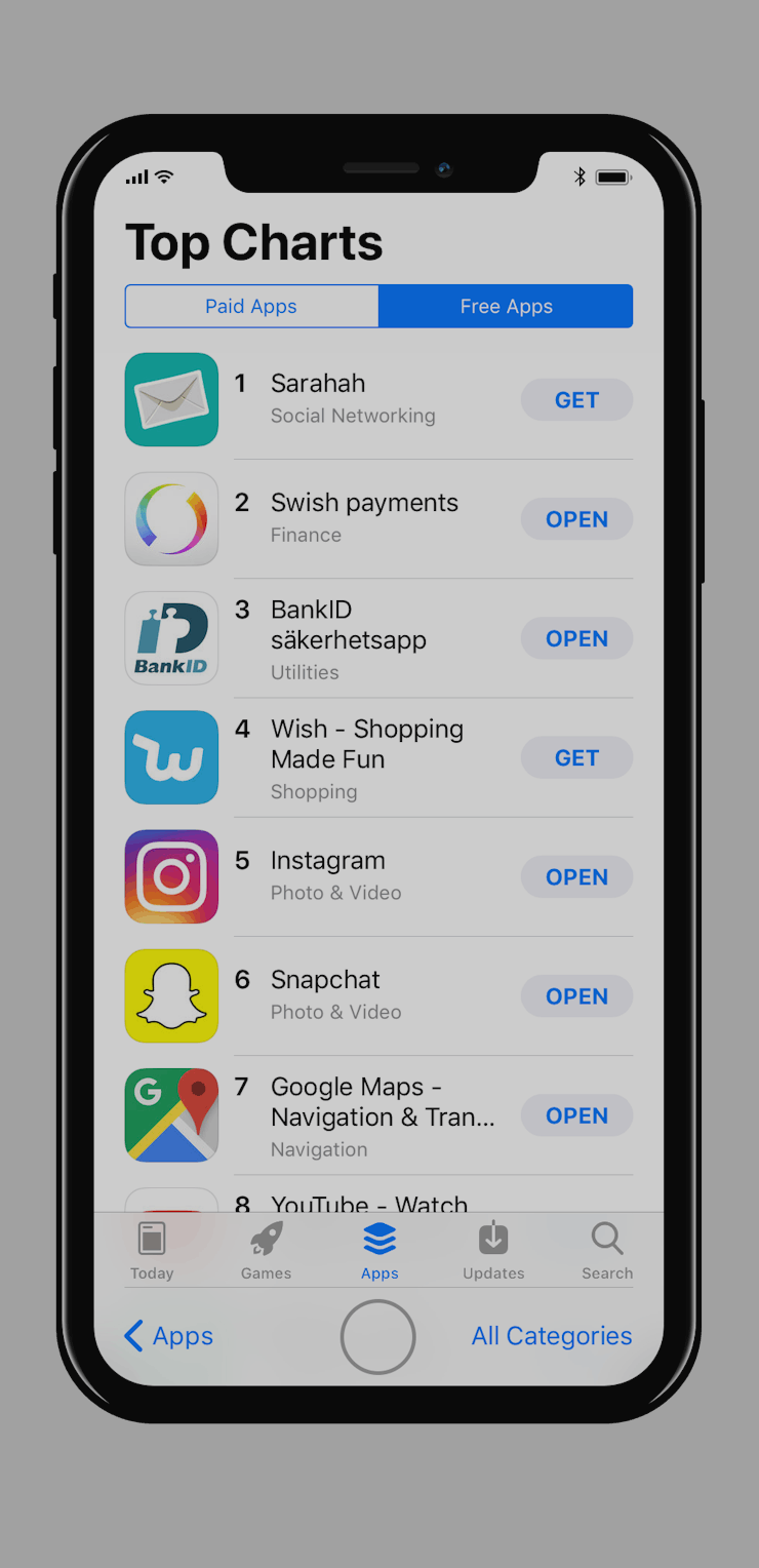
This iPhone 8 Mockup Explains Why iOS 11 Has Such a Weird Design
This concept clarifies what makes the iPhone 8 tick.

iOS 11 may seem interesting, but on current devices, Apple’s upcoming software update makes some curious design choices. The next iPhone operating system, scheduled for release this fall, baffled developers when it was announced at the WWDC conference in June. Apple’s apps have adopted the style first seen in iOS 10’s Apple Music app: big headers, lots of white space, and a more pronounced button placement.
The iPhone 8 may hold the key to this odd design. This week, designers Max Rudberg and Allen Pike have both released concepts based on leaked images of Apple’s upcoming 5.8-inch smartphone. The phone, set for release this fall, will use an OLED screen capable of switching off individual pixels. This allows for a more interesting design, and iOS 11 may hint at how it plays out in practice.
“It’s going to be wild, people,” Pike said in a blog post detailing his concept. “Hold on to your butts.”
A dummy iPhone 8 compared to the iPhone 7.
The phone is set to pack this giant screen into a device the same size physically as the 4.7-inch iPhone 7. This means the home button will likely appear as a virtual indicator near the lower part of the screen. Pike said that Apple’s extra screen space could allow for the top navigation buttons to move to either side of the virtual home button, like so:
iPhone 7 on iOS 11 on the left, iPhone 8 on iOS 11 on the right.
In the above, Pike has moved the clock to cover the home button, as leaked mockups show the iPhone 8 cuts into the screen near the top to allow for camera and speaker cutouts. While there’s enough space on either side to house the notification icons, the clock has to find a new home.
It seems like a welcome alteration, but Rudberg took things one step further. In his mockup, he placed four different variations side-by-side of how Apple may experiment with the design:
The iPhone 7 on the far left, followed by three iPhone 8 mockups.
“It’ll be fun to see how wrong this was when the actual announcement comes around,” Rudberg said in a blog post detailing his concept, which was created as a response to Pike’s. “Either way it’s impressive how much more UI [user interface] will fit in the same form factor.”
At least Pike and Rudberg’s concepts explain why Apple may have chosen a design with a lot of empty space at the top.