Of Course You Fell for the Fake Millennial Voting Map
It was a perfect case study of viral internet misinformation.

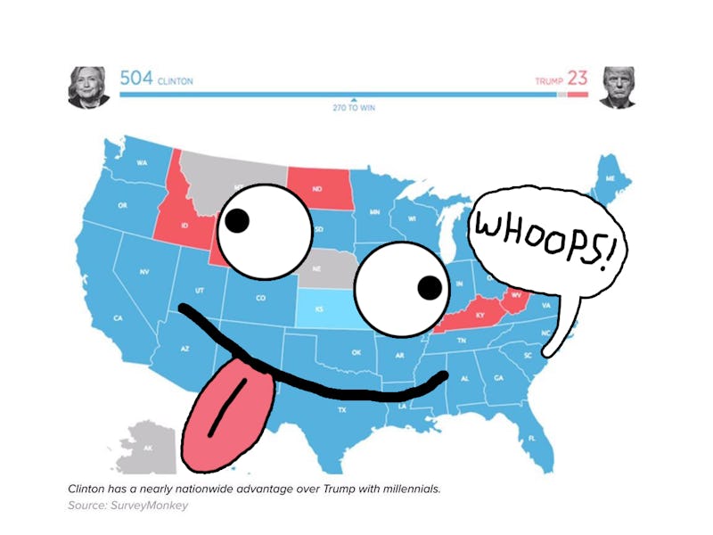
On Tuesday night, liberals were devastated. The Democratic nominee for president, Hillary Clinton, had lost in a stunning upset to her opponent, Donald Trump. There were problems with Clinton’s campaign, sure, but it can’t be denied that an ugly wave of white nationalism helped sweep Trump into the White House. Distraught people on the left looked for hope, and they found it: an overwhelmingly blue map purporting to be the millennial vote. The youth of America would save tomorrow! Various tweets — many from reputable sources — went viral, and the map was a fixture on every left-leaning timeline.
Of course, the whole thing was bogus. The map wasn’t a depiction of Election Night returns, but of a poll from two weeks prior. And, if this election taught us anything, it’s that polls aren’t always right. Lots of users totally fell for it, but it makes sense that the masses were gullible. The “If Only Millennials Voted” map was the perfect bit of viral misinformation for the time.
To start with, it was an emotional night. Most liberals were prepared for a victory party and ended up watching Clinton’s lead in Florida, and then their vision of the future, crumble in front of them. They weren’t exactly thinking rationally.
So then along comes this map. It’s originally from a SurveyMonkey poll of the youth electorate that people probably saw in an October 25 Mic article. Some Twitter user shares it. Maybe they knew it wasn’t a real-time exit poll, and just wanted to use it as a broader example of demographic trends. Maybe they were duped from the start. Either way, it starts to spread, because the people sharing it trust ~data~ and don’t know that it’s from a pre-election poll, because why would they bother to reverse image search and hunt for a source. (Or read the SurveyMonkey citation at the bottom of the map.)
Perhaps what made it such an enduring bit of misinformation is that the millenial-only map is based in truth — just the wrong type of truth. Millenials do lean to the left, politically. It’s reasonable to think that the actual voting habits of the age cohort would look similar to the map.
There’s a larger, darker reason why this map spread. It’s hopeful, yes, but it’s also easy. Shaun Lau, an Asian-American writer and podcaster, explained the problem with the map aside from its fundamental inaccuracy. In a series of tweets, Lau wrote that retweeting the map was one of the laziest things a white liberal could do. Resting easy on the faith that time along will fix racism and inequality avoids “dealing with white supremacy,” he wrote, calling it the “let the old bigots, of which I’m not one, die off” routine.
Activism takes more than a retweet. But, if you are going to retweet something, at the very least check your sources first.