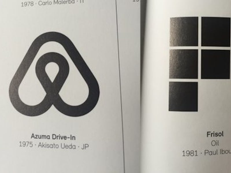
Beats, AirBnB, and Flipboard Lifted Their Logos From the Same 1989 Design Book
Inspirations overlap, but these are pretty blatant.

Much like emojis, logos denote a lot of meaning in very little space or time. The lowercase “b” and vinyl record shape of the Apple-owned Beats logo became the symbol of an over-ear headphone revival, and AirBnB’s looping “A” became a destination for travelers looking for a cheap place to crash.
However, nothing is original, and both of those logos, as well as symbols from Hootsuite, Flipboard, and Medium, all seem to have been taken from the same design book.
Spencer Chen, vice president of marketing and business development for the Chinese online retailer Alibaba, exposed the similarities between these companies’ logos and ones printed in a 1989 design book, Trademarks & Symbols of the World: The Alphabet in Design, which has illustrations of nearly identical logos to those of modern companies — companies that are making millions off brand engagement and familiarity, no less.
Twitter commenters were quick to point out that this sort of thing happens a lot in the design world, especially in logos where there’s a finite combination of abstract letters to construct. One user posted a blog entry that compares several other modern logo designs to each other and points out that, as people live and ingest the same cultural phenomena, there is bound to be overlap.
However, as Chen himself points out, the similarities here go beyond inspiration.
Chen’s original post includes photos of what the public has come to know as the Beats logo, but this version was crafted for a different company all the way back in 1971. Similarly, the stacked blocks of the Flipboard logo was created in 1981 and the Medium logo in 1977.
The Beats logo on the right compared to one found in the 1989 design book Tweeted by Spencer Chen.
Commenters also pulled from the book the image which has become universally known as the bluetooth symbol, as well as an image of an owl that’s strikingly familiar as the Hootsuite logo. The original owl, according to the photo, was created in 1969 by Erik Ellegaard Frederiksen for the Association of the Swedish Book Trade.
A side-by-side comparison of the two logos.
According to Chen, nothing is original, especially in design.