Reddit's Map of the Uber Versus Taxi War in NYC is Lit

We all know that Uber is huge. The compan app sget millions of people to their destinations every month. Not always happily, but hey.
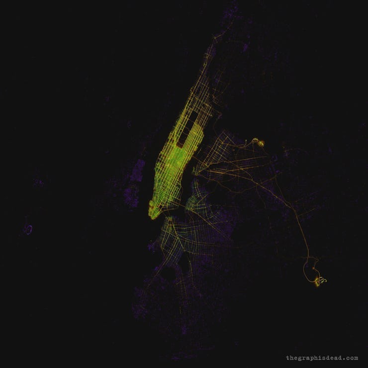
This map, however, uses 2015 data collected by FiveThirtyEight, to show that the company hasn’t dominated the world completely. Reddit users compiled the data to chart the competition between Uber (and only Uber, sorry Lyft fans) and New York City taxi cabs making a map that’s both kinda beautiful and full of revelations about the way people move around the city.
Basically, Uber is purple, cabs are orange, and the overlap between the two is green. It makes clear that Uber dominates the outer boroughs of Queens and Brooklyn, where taxis are a little harder to hail on the street. In Manhattan, which is positively pulsating with neon green transit options, cabs are easy to hail, but many people opt for Uber anyway.
Two standouts are the city’s major airports — LaGuardia, the little orb parallel with Central Park, and John F. Kennedy, farther south, which sits in darkness, save for the faint trail of taillights that connect it with midtown Manhattan. Everyone here needs some kind of transportation to get back to the city and Uber and taxis both seem to be doing well, though Uber is ultimately doing better just about everywhere in the city.
Though taxi cabs persist, Uber and other ride share apps continue to make gains today. Even when Uber reportedly lost 200,000 users in the #DeleteUber movement in February, many of those angry customers are thought to have moved to Lyft, keeping the rideshare trend stable. Plus, wholly new app alternatives to Lyft and Uber are popping up every day.
What’s more, even though an increasing number of drivers are expressing resentment for low wages and techno-manipulation, users still love the ease of calling a car with the press of the button. And that’s ultimately what’ll keep the purple parts of this map metastasizing.