The Real 2016 Political Map Is Shockingly Different from CNN's
This is a weird version of America.

As the results for America’s 2016 presidential election started to roll in, nearly every news network displayed a map of the 50 states turning into huge blocks of red or blue, as Hillary Clinton and Donald Trump laid claim to their electoral votes. Standard electoral maps make it look like the country has huge, gaping divides between red and blue states. While our country may be experiencing a relatively drastic urban-rural divide, electoral maps that color wide swathes of the country for one political party aren’t really representative at all.
Fortunately, there are a lot of different ways to visualize political opinions and voting across the nation. Each big election cycle, Mark Newman, a professor in the Department of Physics and Center for the Study of Complex Systems at the University of Michigan, crunches the election data into some seriously weird-looking maps that are way different from the one CNN gets scarily obsessed with.
Find someone who looks at you the way John King looks at his election map.
Here’s what the standard electoral map of the U.S. looked like after Trump’s victory.
Red for Republican, blue for Democrat, of course.
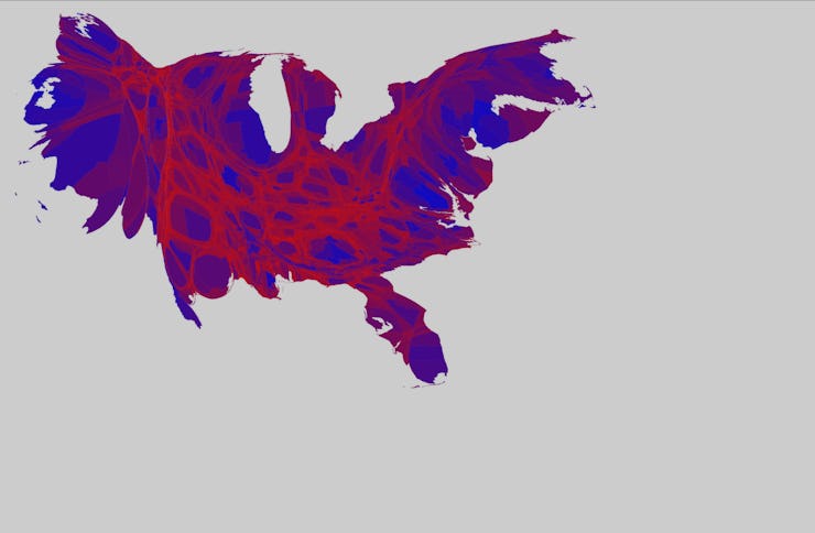
That looks like a lot of red, right? But seeing as Hillary Clinton actually won the popular vote, but lost the Electoral College, the flat map can’t be a good way to show what the country looks like. So Newman made a “cartogram,” a map where the states were drawn, not according to their relative size to one another, but according to their population. So states with a lot of people, like New York, get way bigger, and states like Montana, that have a population of about 12 people, shrink down to almost nothing.
Florida still looks like a penis.
But even then, the entire geography of the country is still divided into two groups, Republicans and Democrats. But plenty of Democrats live in Republican states, and vice versa. And that’s where Newman’s best map comes in. He analyzed the election results by county, not state, and then added in shades of purple to represent the percentages of votes each party got in those areas. Now it’s starting to look more like America.
This is our country.
You can see that there are still strong liberal and conservative areas, like the conservative swathes of the Great Plains and the heavily liberal, urban pockets of the South and California coast, but everything else is less clear. And if you make a cartogram of the whole thing, it looks even crazier. Newman’s final map makes the most populous counties in the country look huge, twisting the whole country into a tie-dye kaleidoscope of blue, red, and purple.
What even is this thing?
You can see these maps and read a point-by-point breakdown of the process over on Newman’s site. It just goes to show, political divisions in America aren’t black and white, nor are they just blue and red.