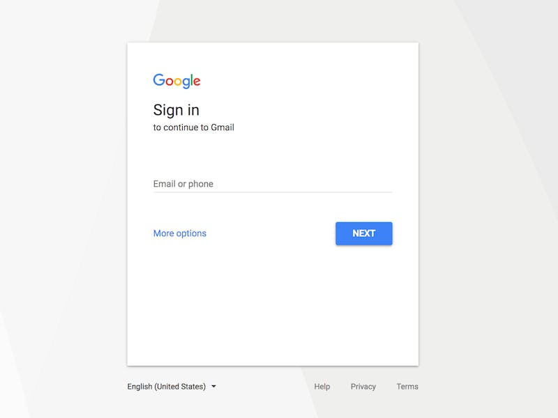
Gmail Will Change Its Sign-In Page for This Design Reason
All hail the single box!

The march of cross-platform integration never ceases, least of all at Google. This week the search giant (or is at an A.I giant?) announced that it will be updating the sign in page for Gmail over the coming weeks, as part of an overall move toward erasing the distinctions between phone, tablet, and desktop browsing, whether or not its users actually want that change.
Users should start seeing the new design over the coming days, with an alert appearing at the bottom of their screens for a few days beforehand. Other users should be seeing the update, already.
All Hail the Single Box
The biggest change is the new design’s loss of separated username/password boxes in favor of a single box that switches to take the password after receiving the username. In principle, this should make it quicker to log in without the need to use the mouse or tab button to switch between input boxes.
Like city planners, web designers often create spaces that get embedded in people’s minds and become familiar through sheer constancy over years of frequent use. Google’s over-arching sign-in page, which stands guard between anonymous users and everything from Maps to Fit to Gmail, is a perfect example.
Most importantly, though, this is a major step in Google’s ongoing quest to bring their desktop, phone, and tablet, and Chromebook experiences into alignment. This means that while veteran PC users probably don’t understand why some others find it so difficult to just tab between boxes, they still have to get used to an interface that’s essentially designed for thumbs on touchscreens. When all interface elements must unite, they by necessity unite under the standard that allows the widest use.
The update is being applied across the entire Google ecosystem, not just for Gmail but for all desktop services, along with the Android and ChromeOS logins as well. Users of the company’s GSuite enterprise service will also be seeing the change, and losing the ability to stay signed in at the same time.
This sort of cross-platform integration is at the heart of Google’s new self-image. The idea is that the real platforms are software platforms, which is a hard idea to drive home when the physical device seems to dictate a lot about the design and function of the service. Had all three platforms been ubiquitous when Google began its expansion into every corner of computing, it probably would have tried to design everything like this from the start — as is, the world’s largest company is finally taking the steps needed to make up for its own past lack of internal coordination.
If you don’t like the new design as much as the old one, don’t fret; There’s nothing you can do to change their minds, but like a newly rebuilt section of the old neighborhood, this new version of an old standby will quickly become the new normal, and feel just as natural as the original it’s designed to make us forget.