Tech
Microsoft’s archaic Windows system icons are getting a fresh coat of paint
It's part of a "sweeping visual rejuvenation" planned for later this year.
Microsoft is finally going to update the system icons in Windows 10 as part of a visual overhaul of the operating system. The company has never confirmed the project, codenamed Sun Valley, but a job listing from earlier this year indicated a coming “sweeping visual rejuvenation of Windows.”
Iconography — A number of the refreshed icons have already been spotted in preview versions of Windows 10, but Windows Latest has now found ones for hibernation mode, networking, memory, floppy drives, and more.
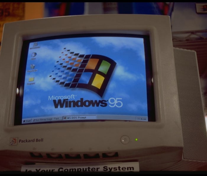
It’s about time that Microsoft updated the system icons that have been present in Windows since the ‘90s. But it seems like the company is only putting a new coat of paint on, not fundamentally changing them for the modern era.
Icons are visual shorthand for different actions. Nobody has used a floppy drive in years, and yet it still represents the action of saving a file. But the icon has sort of transcended the physical item it used to represent, so it’s probably not going anywhere. Everyone knows the floppy drive means ‘save’. Microsoft would probably like developers to stop using it when another icon would be more appropriate, though.
Visual consistency — The refreshed icons should nonetheless go a ways towards hiding the legacy parts of Windows. It’s always been a bit jarring how much of Windows 10 looks modern, and then occasionally you’re thrown a dated-looking dialogue box because Microsoft hasn’t bothered to update the design. It didn’t really have a reason to do so considering Windows remains the de-facto OS in the enterprise world, and that’s not looking to change anytime soon.
