Tech
Google is rolling out an updated search results design on desktop
New icons will make it easier to scan results.
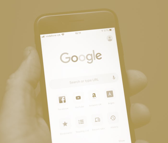
Google is rolling out an updated design for its search results page that it says should make finding what you're looking for a lot easier. The design has been live on mobile since May, but Google says it will finally hit desktop this week.
In particular, a website’s name and icon (“favicon”) will now appear above the page name, making it easier to identify where exactly a search result is coming from. Advertisements are also getting a new, bold “Ad” icon beside them that may be easier to recognize than the previous icon, which was simply outlined in green. It still looks pretty small to me and inconspicuous to me, though.
Search is much busier these days — Google has added new functionality to search of late that it says will be more prominently called out by new visual icons. For instance, searching for a podcast returns a Google Podcasts module with play buttons for starting episodes straight from the search results page. Google also has a movie reel icon that calls out sites where you can purchase movie tickets.
The new icons and prominent site name placement can also help in those instances where you search for a product, like Aesop skincare, and the promoted results at the top trick you into visiting a retailer like Nordstrom. This is something that annoys me personally, and I'm sure I'm not alone.
Altogether, Google says the new design “puts a site’s brand front & center, helping searchers better understand where information is coming from, more easily scan results, & decide to explore.”
