Design
These logo mashups will make you question the nature of reality
One designer was brave enough to ask what happens when you take the visual identities for disparate things, like Peta and Metallica, and put them together.
Logo mashups are all about messing with your head. They take the incredibly familiar and make something new that's sometimes humorous, sometimes unsettling. Logos aren't just potent shorthand for brands' ideals and products, they're a potent force for inducing nostalgia.
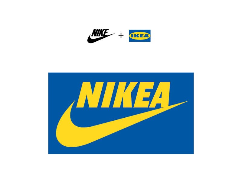
Montreal-based designer Olivier Bruel has combined the logos of various companies to create some of the most bizarre, whimsical, and in some cases, unnerving logo mashups on the internet using some of the world's most recognizable brands. We spotted them on design site Brand New, and had to share them. In some cases, the results seem so obvious you'll wish you thought of them first. In other cases, you might wish you could unsee them.
Tesla and Slack — Tesla's sharp T combined with Slack's colors creates a brain-bending mashup. The latter has recently already conducted significant interface changes to accommodate the spike of remote workers due to COVID-19. Maybe it wouldn't hurt to experiment around with its logo, too. Though if it does, it should probably aim for something cooler, calmer and more collected. Something that says "productivity" more than it does "mental breakdown."

Lego and Google — Lego, which recently released photos of its forthcoming 2,646-piece Nintendo Entertainment System (NES) set, and Google's logos mixed together makes for the awkward mouthful "Legoogle." Which sounds, appropriately, like a French knock-off of the world's best-known online search and advertising company. It certainly makes the latter's name and logo look more childlike thanks to Lego's soft-cornered typeface.

Coca-Cola and Lacoste — What happens when you combine Coca-Cola's cursive logo with Lacoste's joyful alligator? You get Coca-Colacoste. The logo mashup wouldn't look too bad on a polo shirt, though you'd need to get up close to read it. It's probably better suited to an aluminum tin or plastic bottle.

Audi and Disney — Audi's signature four circles combined with Disney's logo ends up resulting in Audisney, which brilliantly combines the automaker's iconic four rings with a fifth, centered one for a Mickey Mouse ears look. The result reminds us distinctly of Banksy's Dismaland project.

Ray-Ban and Banania — Bruel's work also reminds us of culture jamming-style ads that ask us to question the nature of brands, the purpose of advertising, and how we're manipulated into assigning emotional content and personalities to corporate entities. His Ray-Ban and Banania logo reminds us that every brand could just as easily have been called something else entirely. It's also delightfully lighthearted.

Peta and Metallica — Speaking of humor, this particular mashup between heavy metal legends Metallica and the controversy-riddled Peta results in the hilarious "Petallica" with a bunny hopping over the letters. You can almost imagine a sweaty and scowling James Hetfield singing about saving animals while headbanging.

Shell and Hello Kitty — This particular logo mashup combines the oil industry titan Shell and the tender Hello Kitty to create another dystopian-but-hilarious combination. We felt a little uneasy when we first spotted the iconic, happy little bow in the corner of the shell.

Twitter and Terminator — When you combine the signature Twitter bird and Terminator into one image, you create an unholy metallic bird with a raging steel skull. If that doesn't truly encapsulate the essence of Twitter and its hoax and hate-filled world, we don't know what does.

Apple and Staples — Bruel's combination of Apple's signature bite-marked fruit and Staples' signature piece of stationery creates the rather straightforward "Stapple" with a logo that swaps the bite for — you guessed it — a staple. Simple. Brilliant.

Nokia and Kia — The only logo mashup that retains one company's identity while swallowing up the other's is the one of Nokia and Kia. It ends up with, well, Nokia. But the two companies logos subtly switch between the style of each as you read them from left to right.

Sun Microsystems and Run-DMC — Sun Microsystems (now owned by Oracle) was one of America's pioneering tech companies. Run-DMC was one of hip-hop's pioneering groups. The remix of their logos is pitch-perfect.

Maybe you could get one of these logo mashups on a shirt of yours — with Bruel's permission, of course. It may not have the hype of Supreme's COVID-19 logo shirt or Noah's reworked version of its usual branding for its own coronavirus-relief efforts, but it's bound to get some double-takes from passersby.
