Design
This trippy font made up of fake numbers solves an annoying design problem
Numbers in a mockup design can distract, so IDEO made a whole collection of non-numbers.
You've probably heard of Lorem Ipsum before — blocks of placeholder text that look to be real Latin, but are actually just nonsensical words with no meaning. The point of the text is for use in design mockups where it can stand in for real information without distracting those who are trying to evaluate the design. But the folks at IDEO realized that numbers also pose an issue. People get distracted by data in a mockup when it doesn't seem quite right, even knowing the numbers are just placeholders.
"Whether it's restaurant data or health data, a wrong number — even if it's a placeholder — causes the viewer to want to correct that 'wrong-ness' rather than respond to the placement, color, or size of the numbers," say designers Dave Vondle and Chris Kucharczyk. The team decided it needed a solution.
The foreign language problem — The team explains that if you pick up a newspaper written in a language you don't know, your eyes will look at the writing and mostly tune it out. But if you see a chart or a graph on the same page, your brain will start to wonder what the numbers are trying to communicate.
In regards to mockups, however, the data doesn't mean anything. The numbers being represented in a sales chart might not match the visuals exactly because the designer made the chart and then threw some random placeholder numbers in. Or the readings of vitals on a health chart might not be realistic to a real-world scenario because the designer isn't a medical expert and simply used random data.
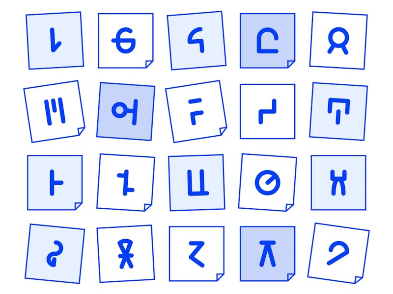
The designer really only cares about getting feedback on the design itself, not the numbers. But apparently, numbers cause clients to lose the plot and get distracted wanting to correct them. So IDEO decided to resolve the issue by making a font of fake numbers in the same vein as Lorem Ipsum.

It's clever — Norum Ipnum, as it's called, is what the team came up with. Look at any of the "numbers" being represented in the chart pictured above and you can see a client couldn't interpret whether they're properly correlated to the height of the bars. Or whether they're an accurate reflection of the numbers a client might see in their actual business. The numbers can't be corrected because they aren't numbers at all. They're meaningless characters that can be tuned out so focus remains on the design.
This project is pretty much the perfect design school project. A problem was identified and smartly solved with design. But perhaps it would be easier to simply ask the client for real data that could be used in the mockup? All we're saying is learning effective communication with people outside the field of design could be more practical than creating an entirely new font — especially one like Norum Ipnum that by the looks of it might make you fear you're having a stroke.
Either way, if you're into that kind of thing, IDEO has an explanation on their site of how they designed Norum Ipnum.
