Design
Fan design shows how Apple's iPad widgets could be much better
Designer Parker Ortolani's concepts are simple and useful. Hope you're listening with your wallet ready, Apple.

When Apple announced the introduction of widgets on the home screen in iOS 14 at this year’s WWDC, tech fans rejoiced. Finally, widgets on the home screen — and resizable, smart widgets, at that.
But the widget implementation on iPadOS is not so kind. Widgets can only be pinned to a specific area of the first home screen page, and they’re not exactly easy to organize. The iPad widget experience is frustrating, more so because the tablet’s larger screen could lend itself very, very well to the expansion of Apple’s new widgets.
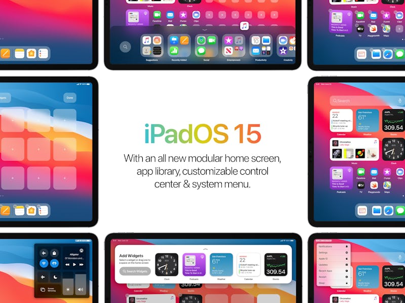
That’s why Parker Ortolani, a New York-based designer and brand strategist, created a mock-up of how Apple might still better the iPadOS widget experience in future iterations of the operating system. Ortolani posted the concept designs on his Twitter account earlier this week, giving us a taste of what Apple’s widgets could achieve on the iPad if given the proper room to thrive.
Truly modular — Apple’s new widget design dreams of infinite customization: drag and drop your widgets and your apps in any order you please, wherever you please. But for some reason the widgets are — at least for now — relegated to only one portion of one home screen.
Ortolani’s concept allows for a truly modular experience, whereby the user can place apps and widgets anywhere on the screen at all — even with empty spaces between them.
A menu for pros — Ortolani doesn’t just stop at widgets; his dream tablet operating system also includes what he calls a “Pro Menu.”
Much like the Control Center, the Pro Menu can be called forth while using any iPad app or from the home screen. The menu offers quick access to many useful tools, such as shortcuts to settings, notifications, and a quick restart button. It’s similar to the Apple icon drop-down from the menu bar on macOS.
Make life easier — Operating system updates are meant to make our lives easier, and the latest versions of iOS and iPadOS certainly aim in that direction. But they still sometimes miss the mark when it comes to actually allowing users to best implement those new processes.
Ortolani’s Widget Tray is a great illustration of how Apple could quite easily improve its widget implementation. Rather than switching out widgets being a time-consuming process, Ortolani envisions a simple pull-down tray where users can view all their widgets and drag them to the home screen.
Hey Apple: if you happen to be listening in right now, you should pay Parker for his fresh design concepts — you know, rather than just ripping them off years later — and then you should work on implementing them ASAP. Thanks!