Coronavirus
These coronavirus trackers show why it's so important to stay home
The best sources for regularly updated numbers from reliable sources.
Claims that the U.S. will back to normal come Easter are foolhardy, wreckless and dangerous. A slow response to COVID-19 from the outset combined with a lax approach to lockdowns means the coronavirus will be with us well into summer at this rate, and that's being optimistic. The best thing we can all do to slow the spread, reduce the strain on hospitals, and expedite some semblance of a return to normality is stay at home. The second best thing we can do is remind others of the importance of keeping their excursions and contact with other humans to a minimum. These are some of the best resources you can share with them if they need a little convincing.
Johns Hopkins University's Center for Systems Science Engineering

The CSSE dashboard pulls data from the World Health Organization along with the Chinese, European and U.S. centers for disease control and lets you drill down in detail. It's arguably got the most ominous color scheme — for once, dark mode isn't soothing — but also one of the most powerful and easy-to-navigate interfaces.
Three tabs on the left (labeled Admin 1, 2 and 3) let you toggle between reported cases by country, region and U.S. county, while the main map in the center has a pair of tabs that make it easy to switch between cumulative confirmed cases and active cases. There's also a mobile version if you'd like to keep an eye on things from your smartphone, not while you're out in the world (please, don't go out in the world if you don't have to) but for when your laptop is out of reach.
Also, it's probably better to visit reputable websites from your phone or tablet than to hunt for apps in the various app stores, which have become targets for malware.
Worldometer

Ignore the ads used to support the site and pay attention to the numbers and you'll find Worldometer is one of the best and most consistently updated sources of coronavirus data available online. In addition to offering a counter for reported cases, deaths and number of recoveries, the site offers a breakdown by country and a selection of graphs that make it easy to see at a glance how rapidly the number of cases is growing, especially in the U.S., where at time of writing there are now more than 85,000 confirmed instances.
Worldometer also includes links to pertinent news stories, resources for those looking for more information about the coronavirus, and an exhaustive list of the sources it uses to compile its figures. It's incredibly comprehensive and reassuring in its clinical focus on the factual, rather than the anecdotal, and it's a great option if you really don't want to see a global map, which admittedly, can be a little overwhelming.
Weather.com and IBM

If you're an Android user, you're probably familiar with weather.com from tapping through to get more detailed weather forecasts from the weather widget on your phone's home screen. The IBM-owned company has excellent, localized coronavirus tracking along with regularly update maps that can help you visualize the extent of the virus's spread in your vicinity, or in other areas you might be interested in, like those where family or friends live.
Do some digging and you might notice what seem to be discrepensies, like a lack of coronavirus-related death figures for parts of New York. That's likely down the the severe lack of available testing in the state, and will probably be rectified over time as the available data improves.
IBM, meanwhile, has its own coronavirus dashboard that's intended first and foremost for medical professionals and policymakers, but is an excellent resource for the public, too. Another easily-digestible resource for non-medical professionals is Microsoft's recently launched tracking dashboard.
The New York Times

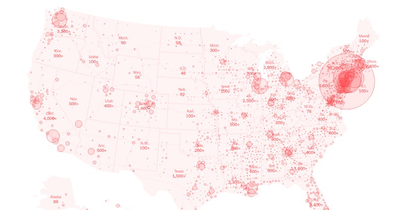
The New York Times has been vociferously tracking the spread of the coronavirus since the alarm was first sounded in Wuhan, China at the end of 2019, and has been updating its data daily since late January when the first U.S. case was reported in Washington state. Its coronavirus portal is frequently updated and breaks down the confirmed cases by region. It also includes color-coded maps showing where the number of cases is growing the most rapidly, and when combined with the range of graphs it offers, is one of the easiest ways to visualize the scale of the challenge facing not just the U.S., but the rest of the world.
One of the most striking things about the NYT's global map is the realization that there is almost no country on earth that's entirely coronavirus-free. The few that are — like Zimbabwe and Lesotho — almost definitely have cases they simply don't yet know about due to a lack of active testing. We'll be very surprised if anywhere aside from the most lightly populated and isolated regions (like small islands) remain unscathed by the pandemic. Github is also collecting and collating the NYT's data and making it available to anyone who wants it.
It's as hard to ignore the news about the coronavirus as it is not to get fatigued by the glut of it. But in these stressful times, it can help to take a look at the numbers divorced from the politics, agendas, and misinformation surrounding them. Let's hope those in power take the numbers to heart and use them — rather than personal interests or the desires of, say, billionaires — to shape their responses.
