The Contrarian
Apple's Touch Bar is good, actually
There's a whole community of Touch Bar fans who are not celebrating the "useless" touchscreen's death. Here's why I'm one of them.
The new 2021 Macbook Pros don’t have a Touch Bar.
Amid news of the M1 Pro, M1 Max, and the return of glorious ports (HDMI! MagSafe! SD card!) Apple killed its last new (if misguided) vision for the future of laptop computing, a much-maligned, multi-touch strip at the top of the keyboard. The closest the company has gotten to adding a touchscreen to a Mac.
As the proud owner of a refurbished 13-inch M1 MacBook Pro, I’m a self-described Touch Bar agnostic. I really don’t think about it all that often. But believe it or not, there are people who do, and they’ll actually miss the programmable, keyboard-length touchscreen now that Apple’s going another way. And after speaking to some of them and experimenting with my own Touch Bar modifications — I think I might feel the same.
A whole new function
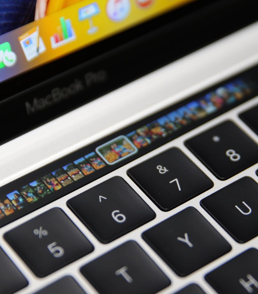
Apple added the Touch Bar to its laptops in 2016, specifically the 13 and 15-inch MacBook Pros. The hardware feature was introduced as a sort of 21st-century replacement to the familiar row of function keys that exist on almost all laptop and desktop computers.
As current Apple fellow and former vice president of worldwide marketing Phil Schiller noted in his “requiem for the function key” at the MacBook Pro launch, the functionality of function keys has really changed since their appearance on early server terminals. They’ve become far simpler and settled into some common uses like volume or brightness control.
“This is crazy! Keeping 45-year-old technology around and mapping other things to it,” Schiller said at Apple’s event.
The Touch Bar was supposed to be the company’s alternative. A “revolutionary new way to use your Mac,” was how Apple described it on its website at launch. Intelligent function key suggestions based on what app you were using, in a more familiar touch-based package.
The tiny, ever-changing multi-touch strip proved to be almost as controversial as other, truly confounding Apple “innovations.” I’ve heard the Touch Bar mentioned in the same breath as the Magic Mouse with upside-down Lightning connector charging, the first-generation Apple Pencil’s similarly annoying charging setup, and the frequently busted and now entirely replaced butterfly keyboard (something Apple also brought to the MacBook Pro alongside the Touch Bar).
Reviewers were cautiously optimistic when the Touch Bar made its initial debut. It wasn’t as revolutionary as Apple claimed — what is in our post-iPhone world — but it was “fast and smooth and responsive” and nice to look at. Having a tool that changed with whatever app you had open was disorienting, but not necessarily a bad idea. You could develop your own muscle memory around it, just like physical keys. In short, it was more than usable.
True believers

One committed Touch Bar fan who asked to go by their Reddit name, KingLucent, connected Apple’s vision for the Touch Bar with Steve Jobs’ original justification for the iPhone’s touch screen hardware. Smartphones in 2007 were littered with physical buttons. “They all have these keyboards that are there whether you need them or not... and they all have these control buttons that are fixed in plastic,” Jobs said. “What happens if you think you have a great idea six months from now, you can't run around and add a button to these things. They're already shipped. So what do you do?”
KingLucent used Apple’s default options when they first got their MacBook Pro but quickly realized they only covered functionality that the function keys or on-screen software buttons already handled. That’s when they turned to BetterTouchTool.
BetterTouchTool (BTT) was created by German developer Andreas Hegenberg as a way of modifying what the wide variety of Apple input methods do on its various software platforms. That includes the trackpad, Magic Mouse, Touch Bar, and even the Siri Remote for the Apple TV. KingLucent started by making permanent volume and brightness buttons. Then they further experimented and tinkered from there, adding Mail and Messages buttons with live updating badges and switching those volume and brightness controls to multitouch gestures. “I’ve found my sweet spot is having persistent tools on the left, glanceable information on the right, and contextual, app-specific buttons in the scrollable middle,” they explained to me.

Another Touch Bar defender, Srivats Lakshman (Srivi20 on Reddit), made similar tweaks. Adding volume and brightness controls, access to a list of launchable apps, and a screenshot tool. Lakshman says they also got plenty of use out of Apple’s built-in features too, like word suggestions, the emoji picker, and an easy way to answer and hang up FaceTime calls. They just wish features like the emoji picker showed up in more places across macOS, rather than just browsers, messaging apps, and some word processors.

I tried my own hand at modifying the Touch Bar with BetterTouchTool. The software works a bit like Apple’s Shortcuts app in that you craft “if this, then that'' interactions for the functionality you want. Much like Apple’s version, it can also seem daunting as hell and requires time reading the accompanying documentation before you can experiment comfortably. I ultimately settled on a preset package of customizations created by product designer Jason Rappaport called GoldenChaos-BTT that offers a lot of what intrigued me about KingLucent’s setup. Application icons for when I receive notifications (in this case Mail), on-screen playback controls for Apple Music, and easy access to Bluetooth settings for when I’m connecting controllers or headphones.

It’s not perfect — and I’ll likely tinker even more — but it shows the promise and wasted potential of Apple’s “revolutionary” new input method.
What could have been
Developers beyond Apple eventually added Touch Bar functionality to their apps, just like Apple promised when the feature launched. But none of those implementations really set the world on fire. There’s a multitude of reasons you could use to justify the problem. Apple has tight control over its hardware and software and often removes the experimental, tinkering spirit from a lot of its products for the sake of ease of use. The company also expressly forbids the Apple Watch complication-style glanceable widgets that BTT makes possible. “Although the Touch Bar is a screen, its primary function is to serve as an input device — not a secondary display,” the company writes in its Human Interface Guidelines.
On one hand that makes sense. There’s no reason why someone using their laptop should spend just as much time staring at a tiny touchscreen above their keyboard as they do the actual display of their computer. But, and I think this is a big “but,” there’s also no reason Apple shouldn’t have opened up the Touch Bar to more customization or more native features. The company is clearly not afraid to introduce complexity to its devices. The Shortcuts app across iOS, iPadOS, and macOS is a great example. As is the ever-evolving multitasking system on the iPad. Yes, something like BetterTouchTool is complicated to use, but Apple’s specialty is simplifying complicated things. Apple really just introduced the Touch Bar and let it rot.
Apple really just introduced the Touch Bar and let it rot.
“I’m not sad to see it go, but I’m disappointed it wasn’t improved upon or worked on,” Input’s social content producer Tom Caswell, who is a closet Touch Bar fan, told me. KingLucent and Lakshman expressed similar sentiments. No one is exactly expecting Apple to come out with a Touch Bar 2.0 that addresses all the things Touch Bar fans want, but it’s a shame the company never took another crack at it. The Asus Zephyrus Duo 15’s giant adjustable touchscreen panel is a great example of an even more elaborate Touch Bar-esque setup. It’s not for everyone, but it’s definitely useful for someone.
Maybe Apple could have offered individual, physical function keys that also double as tiny reconfigurable displays (Apple owns a patent somewhat similar to this) or even just a new keyboard with a normal function row and a Touch Bar above it. There are options.
The issue is not that the Touch Bar is bad, as some reviews might suggest. It’s fun to use, customize, and yes, touch. Apple knows how to design for a good touchscreen. The issue is that the Touch Bar is an unfinished, incomplete thought. And based on Apple’s new powerful pro laptops, it seems like the company now has its mind somewhere else entirely.
