Design
Android 12 is the expressive, colorful, fun software our boring phones need
Using your phone is about to spark a lot more joy with Google’s Material You design language.
Android 12, announced at Google’s annual I/O developer conference today, had me bouncing around my apartment. I literally jumped around on my sofa when VP of Design Matias Duarte showed off the new Material You.
Refreshing. Fun. Expressive. Personal. Playful. I can think of dozens of other words to describe the tingly feelings charging through my body right now. Finally, after almost a decade of mostly the same-old flat design language on Android, Google is revamping its mobile OS with 100 percent more color and squiggly lines (literally).
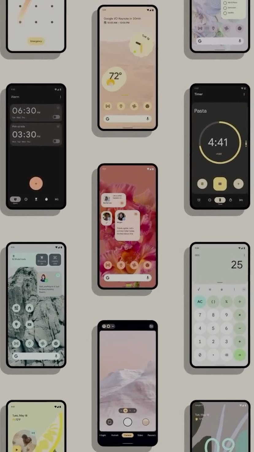
New colors, different button shapes, and even details like the direction of dynamic lighting to illuminate the lock screen (from a swipe or the press of a button) makes the Android OS feel more alive and youthful — and less tool- and computer-like. Material You and Android 12 is exactly the kind of bright and refreshing design mobile software needs.
Our phone software should be vibrant and fun and entertaining. Google gets it.
“We’re at a moment where computers are showing up in places that we never imagined,” said Duarte. “It’s also a moment where people are yearning to express their individuality and demand control from their technology. We believe this is a challenge for the whole industry. To acknowledge that emotion is essential and that beauty is personal.”
Flat design is often synonymous with the idea of reduction or emptiness, but it doesn’t have to be. Our phone software should be vibrant and fun and entertaining. Google gets it. Apple needs to step up; iOS — even with custom widgets — is looking quite dull in comparison.
Form follows feeling

Material You, Google’s evolution of Material Design and coming to Pixel phones first this fall, emphasizes more personalized and colorful palettes. It is form that “follows feeling” instead of function, Duarte says. With Android 12, personalization isn’t just about giving you a bunch of preset color themes or accents, but using machine learning and color science to generate aesthetically pleasing schemes that might fit your mood.
For example, Material You can pluck out color palettes from a wallpaper photo and intelligently choose colors that look good visually across Android’s system UI and function properly (i.e. picking the right contrasting colors for buttons to ensure legibility). Let’s get nerdy — look at those hex color codes!
From what Google has shown, Material You’s colors aren’t just skin deep — they’re app deep. In addition to notifications and buttons within Quick Settings getting the splash of colors, apps like the calendar or calculator take on custom colors in elements like events or buttons. “We can delight every style,” says Duarte.


“No longer defaulting to one size fits all, Material You is a radical new way to think about design. We invested years into advancing UI engineering making it possible for any app, not just Google’s, to blend in their user’s styles, and stay unique and beautiful.”
The challenge, of course, is making sure colors don’t clash. I’ve not seen Material You with my own eyes or tried it yet (I’m downloading the Android 12 developer betas as I write this) so I can’t say with any confidence whether Android 12’s color science engineering is on point or not. But everything Google has shown us sure looks pretty — lickable.
The playfulness of Android 12 is going to breathe new life into Google’s mobile OS.
“As designers, sharing control of every pixel is terrifying. But that leap of faith is revolutionizing design across Google,” says Duarte. “For the first time, we can consider the details of devices together with the pixels on their screens. Beyond light and dark — a mode for every mood.” There’s your not-so-subtle dig at iOS’s two modes: light and dark.
It’s not just colors that are making Android fresh again. Adjustable contrast, text size, and line size all add depth to the flat design. The squiggles are perfect.
Android 12’s Material You is exactly what we need after so many years (especially last year) staring at the same boring software nonstop. The playfulness of Android 12 is going to breathe new life into Google’s mobile OS. Whether or not third-party companies like Samsung or OnePlus will adopt Material You is up to them. But Pixel users, you’re gonna get it.
It’s hard not to feel joy just looking at the bright buttons and widgets. They’re so friendly. When was the last time staring at your phone’s screen brought you genuine delight? One phone might be made of nicer materials than another, but they all work the same: they’re tools to help you do stuff, sell you stuff, suck you down a TikTok hole. But why can’t we have both? Software that doesn’t leave you feeling like a cold, faceless user in a sea of billions of phone users?
Can you feel it? That’s the monotony of white, gray, black clearing way for the warmth of Android 12 of Material You. It’s radiating and I say let’s embrace it.
