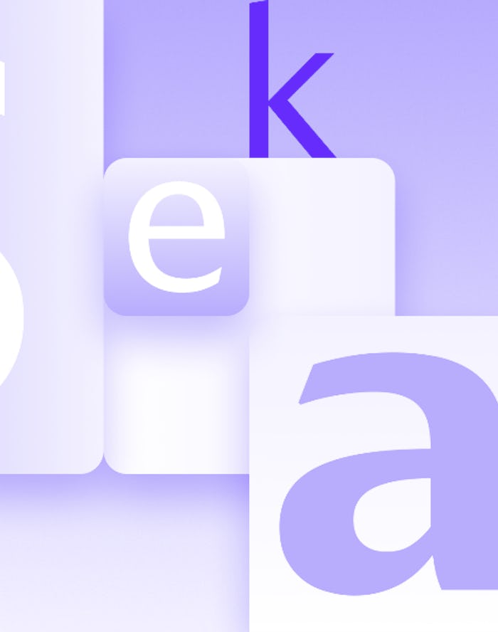
A total of five new fonts — the chosen fonts if you will — have made their way across the Sea of Serifs, trudged across the perilous peaks of Mt. Microsoft, and laid down their swords before us humble Office users so that we may choose our new default champion – One Font to Rule Them All.
Tenorite
First up is “Tenorite” which Microsoft describes as a “warmer” and “friendly” font. We can’t say for sure, but Tenorite may or may not be a bard trained in the alchemical arts and possess an innate affinity with creatures of the woods. What it lacks in combat skills, it makes up for tenfold in charisma. Use Tenorite on your next resumé and receive a +4 on all future vacation requests.
Font by Erin McLaughlin and Wei Huang
Bierstadt
Bierstadt is “a versatile typeface that expresses simplicity and rationality...” With a high degree of intelligence, Bierstadt is best suited for scribing more esoteric, magical texts. This font will not help you write angry screeds begging your roommates to please stop eating your very expensive cashew yogurt, it will make your next free-form poem absolutely levitate off the page.
Font by by Steve Matteson
Skeena
Microsoft is calling Skeena a “humanist” sans serif that is ideal for both long documents and short passages. It’s clear from Microsoft’s description, and from its stately appearance, that Skeena comes from a long line of clerics and is therefore proficient in white magic. With Skeena at your side, all of your future medical files will be clear, unoffensive, and extremely, and utterly, legible. Skeena sans your serif and soothes the soul.
by John Hudson and Paul Hanslow
Seaford
Though Microsoft describes Seaford as “comfortable” and “familiar” we know the truth. Seaford is a seasoned and salty sailor, forged in the tumultuous waters of the Sans Serif Sea. Some may call Seaford a pirate with a heart of gold, but that description fails to encapsulate Seaford’s grittier side. Seaford is a strong ally, but in the wrong circumstances, this font can be an even more fearsome foe. Use Seaford on your next angry customer service email and score a +3 intimidation bonus.
Font by Tobias Frere-Jones, Nina Stössinger, and Fred Shallcrass
Grandview
Grandview is a font with a backstory. According to Microsoft, it’s “derived from classic German road and railway signage, which was designed to be legible at a distance and under poor conditions.” Needless to say, Grandview is a worldly traveler, one you can count on to regale you of tales from afar, though be careful in the presence of a fine mead, because Grandview has a tendency to prattle on. Grandview is a wonderful font, but use only in palatable doses and never while under the influence.
Font by Aaron Bell