Squircle
Instagram's visual refresh doesn't make me want to click buy
As quirky creative inspiration, Instagram's new typeface, gradients, and colors are great. For the company's focus on shopping and video, I'm less sure.
Instagram has a new look. Or at least it’s starting to. The social media app introduced a new typeface, logos, and color gradients for use in the Instagram app and across its marketing today that portrays the photo-app-that-wants-to-be-a-video-app as quirky, colorful, and “expressive.”
I’m just not sure it squares (squircles?) with Instagram’s goal of being a destination for shopping and viral videos, but it is unique.
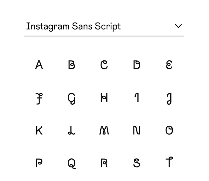
Instagram Sans — The biggest and most visible change to the average feed scroller will probably be Instagram Sans, the company’s new typeface. According to Instagram, the typeface reflects “the shape of the glyph and [its] commitment to simplicity and craft.” In the variety of round and straight-edged elements, Instagram Sans seems to draw inspiration from the app’s square-becoming-a-circle logo, which I’ve learned today is called a “squircle.”
At its most basic — and Regular — Instagram Sans looks like most other sans-serif typefaces, just with a few slightly more exaggerated curves. The notable exception being “Q,” which comes with it’s own distinct squircle-y squiggle. As soon as you jump to Instagram Sans Script, though, all bets are off.
The Script font is over-the-top. Pulling on the squircle, but also Instagram’s own cursive wordmark, it’s definitely unusual to the point of being almost illegible in some cases (that poor “r”). Instagram specifically calls out using Instagram Sans in both Reels and Stories, which would certainly make videos stand out more than the average Tik Tok — if also making captions and video titles possibly difficult to read in some cases.
Gradients — Along with the new fonts, Instagram is updating its five-color gradient (the colored background behind the company’s logo), to make it 3D-animated and context-dependent. The company has a longer and more effusive description on its dedicated gradient page, but what’s less clear is how it’ll actually change in the app.
So what? — Instagram says this redesign is all about expression, inclusion, and creativity but I think it’s easy to wonder where the app’s priorities are. As interest in Facebook has fallen, Meta has put pressure on Instagram to be the next thing. When it’s not a big shopping catalog for brands and creators, it’s competing with Tik Tok for video dominance. The app is pulled in a bunch of different directions and frequently seems very far away from the functionality normal people want to use it for.
A fun, but in my opinion, hard-to-read font, and gradients that look pretty similar to what was there before don’t make me want to watch videos or buy things from ads or shop pages. It sparks a certain amount of creativity and it seems fun to play with, but I’m not sure it gets money in anyone’s hands any easier. It feels like a distraction — like from building an iPad app, something people still want, but Instagram refuses to build for no good reason.
As a creator-driven platform, ultimately whether Instagram’s visual refresh ends up being a meaningful change should be determined by the people who use the app most, not me, someone who’s just trying to track what Instagram thinks its app is for.
But hey, squircles are fun, right?
